
Best Fast Food Restaurant Packaging and Design In The Early 2000s
By
Contents
- What Is Retro Fast Food Design? From Classic Diners to Urban Street Style
- Why Retro Still Works: The Emotional Power of Nostalgia
- Design Elements That Define Retro Fast Food Style
- How to Combine Retro and Modern Without Looking Outdated
- Retro Fast Food Packaging: From Design to Delivery
- Does Retrofit Your Menu? Pairing Products with Design
- Can Retro Be Sustainable?
- Where to Get Retro-Inspired Custom Packaging
- Budgeting for Retro Design: Small Changes, Big Impact
- FAQs
- Conclusion
The early 2000s marked a transition in the fast food world—brands were no longer just selling meals; they were selling moments, vibes, and nostalgia. From milkshake cups with neon swirls to burger wrappers with graffiti-style doodles, retro fast food design exploded across packaging, signage, and interiors. And now, in 2025, it’s back with a vengeance. For restaurant owners looking to stand out, understanding the roots and evolution of retro fast food packaging can unlock massive branding potential.
What Is Retro Fast Food Design? From Classic Diners to Urban Street Style
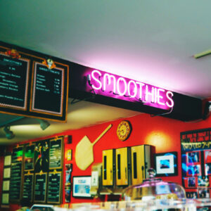
Retro fast food design isn’t limited to red-and-white checkered tabletops or vintage neon signs. It’s an aesthetic inspired by different eras—60s soda fountains, 80s diners, 90s street culture—reimagined for today’s customer.
Two Key Styles:
- Classic Retro: Think Arby’s cowboy hat logos, In-N-Out’s palm tree motif, and Johnny Rockets’ chrome-and-vinyl interiors.
- Street-Inspired Retro: Like Dirty Fries or Meatliquor, which draw from 90s skate culture, graffiti, and zine graphics.
Why Retro Still Works: The Emotional Power of Nostalgia
Younger generations crave nostalgia, even for eras they didn’t live through. Why? Because retro feels authentic, textured, and shareable.
- Visual storytelling: Bold fonts, pop colors, and quirky shapes are Instagram-friendly.
- Emotional branding: Retro evokes comfort, fun, and trust.
- RetroVibes: Social media trends favor eye-catching, photo-ready packaging.
Design Elements That Define Retro Fast Food Style
Color Palettes: From Mustard Yellow to Mint Green
Color is everything. Use nostalgic tones like:
- Red & white checkered
- Mustard yellow
- Teal & seafoam green
- Hot pink & neon purple
Fonts & Graphics: Loud, Playful, and Unapologetically Hand-Drawn
Retro designs lean on:
- Hand-lettered typography
- Exaggerated curves or cartoonish outlines
- Sticker-style logos (like Dirty Fries)
Compare:
- Arby’s: Curated simplicity
- Dirty Fries: Controlled chaos
Material & Finish: Making Retro Feel Tangible
To avoid feeling outdated, use modern materials with vintage flair:
- Uncoated kraft paper
- Matte finishes
- Spot UV highlights for logos
- Single-color risograph-style printing
How to Combine Retro and Modern Without Looking Outdated
Retro must evolve with function. That means:
- Eco-friendly upgrades: Compostable PLA cups, recyclable paper wraps
- Digital-friendly visuals: Logo readability on apps and delivery platforms
Example: Shake Shack blends 70s neon with modern typography and eco-materials for a balanced brand image.
Retro Fast Food Packaging: From Design to Delivery
Packaging as a Brand Extension
Dirty Fries treats every milkshake cup like a collectible art piece. That’s not packaging—that’s brand narrative.
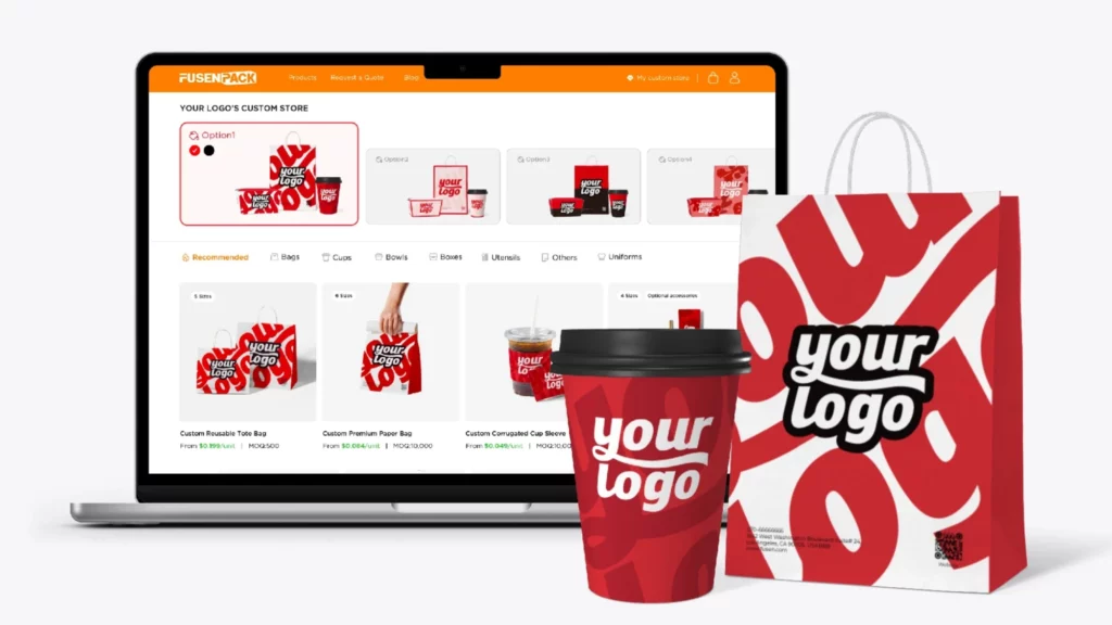
With Fusenpack, you can:
- Tell stories through illustrated cup sets
- Build a cohesive visual universe across wrappers, trays, and bags
- Use QR codes to connect physical packaging with digital experiences
Interactive Packaging Ideas
Encourage interaction and brand loyalty with:
- Limited-edition “zine-style” wrappers
- Collect-them-all cup series
- Printed hashtags for online sharing
Does Retrofit Your Menu? Pairing Products with Design
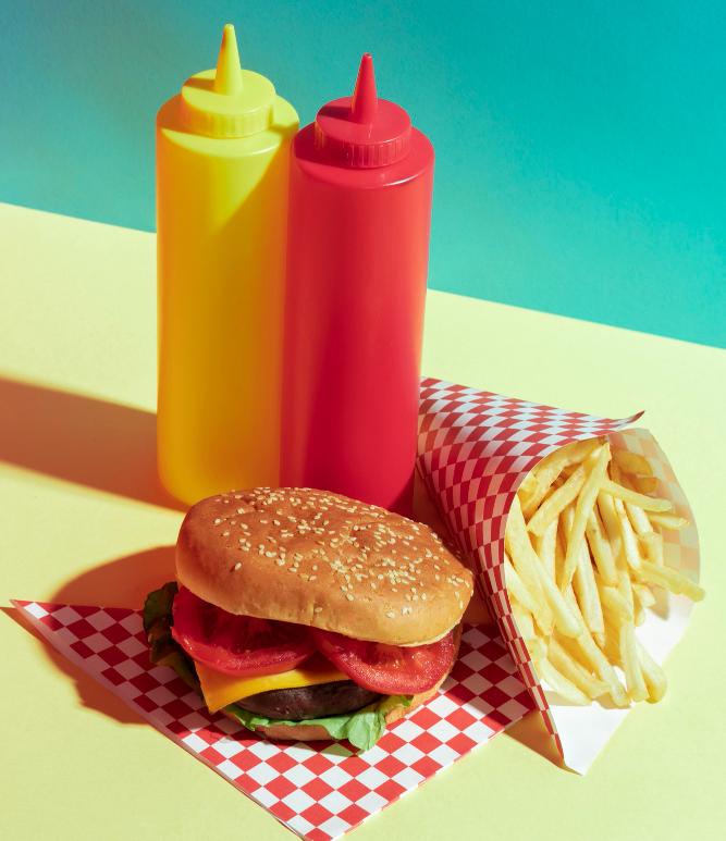
- Burgers: Use classic diner styling – red/white + bold script fonts
- Fried Chicken: Match street culture themes – neon graffiti + hand-drawn icons
- Milkshakes: Embrace pastel gradients + 80s soda shop fonts
- Pizza: Bring in pop art and old-school serif typography
Can Retro Be Sustainable?
Yes. Retro and eco don’t conflict—they complement.
- Use Kraft paper with retro print overlays
- Substitute foam with bagasse trays or PLA cups
Fusenpack offers:
- Low MOQ retro-style PLA drinkware
- Non-coated paper bags suitable for single-color retro prints
Where to Get Retro-Inspired Custom Packaging
Finding the right partner matters. Fusenpack helps restaurant owners bring retro visions to life with:
- One-stop packaging solutions (bags, cups, wraps, boxes, labels)
- Free design concept proposals within 24 hours
- Low MOQs and fast U.S. delivery
Budgeting for Retro Design: Small Changes, Big Impact
- Start with basics: Plain kraft boxes + custom retro stickers
- Mix standard items with small-batch custom runs
- Use Fusenpack’s free 3D previews to visualize before committing
FAQs
Q: What is retro fast food design? A: It refers to design styles inspired by past eras (60s–90s), used in packaging, interiors, and branding to create nostalgia and appeal.
Q: How do I make retro design look modern? A: Use classic visual elements with modern materials and digital compatibility (e.g., sustainable paper with bold vintage typography).
Q: Is retro design appealing to younger customers? A: Yes! Gen Z and Millennials are highly responsive to nostalgic, collectible, and shareable design.
Q: Where can I find suppliers for retro packaging? A: Fusenpack offers affordable, customizable retro-style packaging with low MOQs and design support.
Q: Can retro design be sustainable? A: Absolutely. Fusenpack provides eco-friendly packaging options that still deliver vintage flair.
Conclusion
From bold diner nostalgia to rebellious street art vibes, retro fast food design creates instant impact. It invites customers into a story, not just a transaction.
Whether you’re launching a new brand or reviving an old favorite, retro can give your restaurant the flavor it needs, visually and emotionally.