

Coffee Storefront Design Idea: Creating a Memorable Brand Experience
By
Contents
Discover creative coffee storefront design ideas to attract customers and enhance your brand image. Learn how leading coffee shops like Starbucks and Blue Bottle use their storefronts to make a lasting impression.
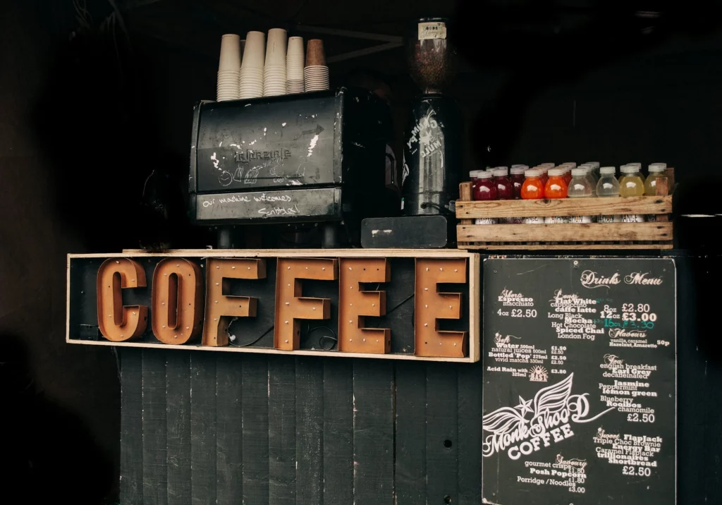
In today’s world, coffee has become more than just a drink—it’s a lifestyle. If you want to open a successful coffee shop, a well-designed storefront is essential. A coffee shop’s storefront design is often the first thing that attracts customers and serves as a crucial part of your brand identity. Here are some standout examples of coffee storefront design ideas to inspire your own café.
1. Starbucks
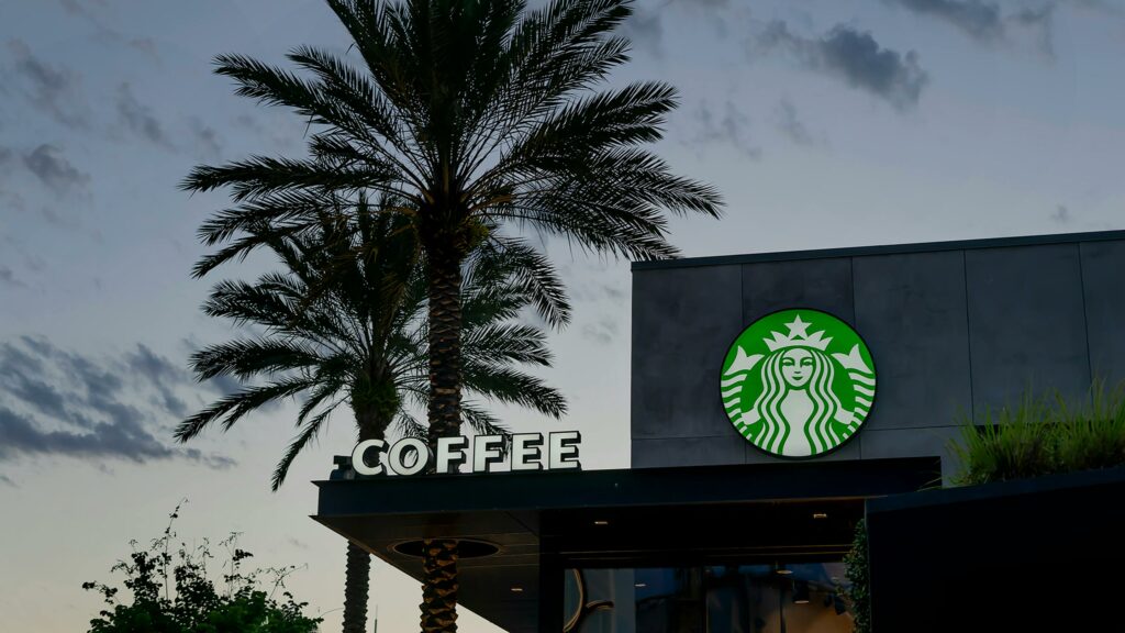
- Simplicity and Recognition: Starbucks uses a deep green color palette and its iconic mermaid logo, ensuring high brand recognition.
- Consistency: No matter the location, Starbucks maintains a uniform storefront design that communicates stability and trust.
- Localization: In flagship or regional stores, Starbucks incorporates local cultural elements. For example, its Kyoto store features traditional wooden façades that blend with the surrounding architecture.
Takeaway: Starbucks builds a strong brand identity with a simple logo and color scheme while adapting its design to fit local cultures.
2. Blue Bottle Coffee
- Minimalist Design: Blue Bottle focuses on simplicity with clean white or gray backdrops and a single blue bottle logo.
- Experience-Driven: By avoiding excessive decoration, the storefront aligns with the brand’s handcrafted coffee philosophy.
- Environmental Harmony: Each storefront blends seamlessly with its surrounding architecture, creating a cohesive and inviting atmosphere.
Takeaway: Minimalist storefronts attract customers who appreciate simplicity and emphasize quality craftsmanship.
3. Peet’s Coffee
- Warm and Modern: Peet’s Coffee combines deep brown and cream tones to create a cozy, inviting ambiance.
- Heritage Meets Modernity: The classic Peet’s Coffee font highlights the brand’s rich history, while the updated logo adds a touch of modernity.
- Functional Messaging: Some stores feature taglines like “Handcrafted Roasts,” reinforcing the brand’s artisanal focus.
Takeaway: Peet’s Coffee effectively uses color and typography to communicate its legacy while staying relevant to modern customers.
4. Philz Coffee
Vibrant Colors: Philz Coffee uses warm greens and browns paired with hand-drawn logos to create a relaxed and approachable feel.
Open Concept: Large windows and glass doors invite customers to peek inside and feel connected to the space.
Community Vibes: Some locations include local artwork or neighborhood-inspired elements in the storefront design.
Takeaway: Open and colorful designs foster a sense of connection, making customers feel welcome and part of the community.
A Valuable Piece of Advice
One key takeaway is that a logo plays a pivotal role in any storefront design. A well-crafted logo can communicate your brand’s core values and leave a lasting impression.
If you need professional assistance, FUSENPACK is an excellent choice. They specialize in AI design, offering innovative and efficient solutions to create standout logos and packaging. What’s more, FUSENPACK understands that every brand is unique. They go beyond AI automation by providing manual adjustments to refine and perfect designs according to your specific preferences and vision.
Conclusion
Each of these coffee shops demonstrates how thoughtful storefront design can attract customers, enhance brand identity, and communicate the essence of the business. From Starbucks’ iconic logo to Philz Coffee’s community-inspired approach, these coffee storefront design ideas show the importance of balancing consistency with creativity.