

Ice Cream Shop Logo Design: Picking the Perfect Elements
By
Contents
Introduction
Remember when we designed a Thai restaurant logo together? This time, let’s create an ice cream shop logo! If you were in charge, what elements would you pick? Here’s a guide to crafting a logo that captures the essence of your shop and draws customers in. And with FUSENPACK’s help, you’ll be equipped to make your brand shine!
Element 1: Playful Colors or Minimalist Tones?
The colors you choose set the tone for your ice cream shop’s style. If your shop is all about fun and joy, bright colors like pinks, blues, and mint green can capture that playful vibe. On the other hand, if you’re going for a chic, minimalist look, opt for softer colors or monochromatic tones that exude sophistication.

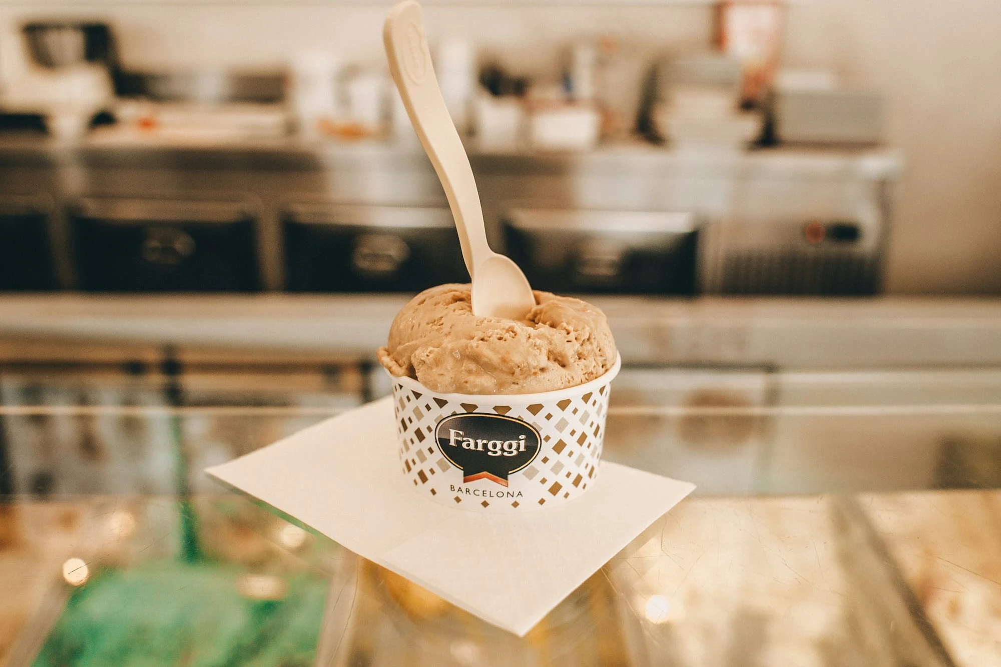
Element 2: To Use an Ice Cream Icon or Not?
Nothing says “ice cream” like an actual ice cream icon! A cone or scoop graphic makes your logo instantly recognizable. But if you’re aiming for a more abstract or unique design, you might skip the icon and rely on color and font to convey the feel of your shop. Either way, FUSENPACK can help you find the balance that aligns with your brand’s personality.
Element 3: Handwritten, Rounded Font or Elegant, Slim Font?
Fonts are another way to communicate your shop’s vibe. If you want to create a friendly, approachable feel, go with a rounded, playful font. For a touch of elegance, a slim, refined font could be the way to go. The choice of font is key in giving your logo its personality, so pick one that aligns with the overall feel of your shop.
-1024x883.jpg)
Additional Tips to Consider
Keep It Simple and Memorable
A great ice cream shop logo is simple yet memorable. Avoid overcrowding the design with too many graphics or words. Try combining your brand name with one strong icon or pattern. Simple logos are easy to remember and look great on everything from signage to packaging.

Highlight Your Brand’s Unique Features
Does your shop offer something special, like homemade organic flavors or regionally inspired ingredients? Show it off in your logo! A unique touch, like an ingredient icon or location-based design, can make your brand stand out and give customers a quick insight into what makes your shop unique.
Test and Adjust
Once you’ve designed your logo, test it in various applications—menus, packaging, social media—to see how it looks. Make sure it’s clear and visually appealing in different sizes and backgrounds. FUSENPACK can assist with these final adjustments, ensuring your logo looks great everywhere it appears.
Conclusion
Creating a logo for your ice cream shop is all about choosing elements that reflect your shop’s vibe. From color choices to font style, each decision helps shape the identity of your brand. With FUSENPACK by your side, you can achieve a logo that’s both memorable and true to your vision. Now, it’s time to get designing—let’s bring your brand to life!